A brand is the heartbeat of a company and its values, aspirations, and promises to its clients. It is a beacon to choose HCM not just for what is offered, but the unique experience of working with HCM.
Cohesive application of the HCM brand is crucial to maintain an effective identity system and builds trust with clients. Changing any component beyond the brand guide will weaken its impact and lessen the consistent image that ought to be conveyed to the audience.
Embrace the brand standards, and it will be the catalyst to HCM’s success.
Brand Guide
The information in this guide exists to educate and equip you with the tools needed to effectively use the HCM brand in various design situations while maintaining the integrity of the brand. Everyone is responsible for proper brand usage. Download a copy of the full brand guide below.
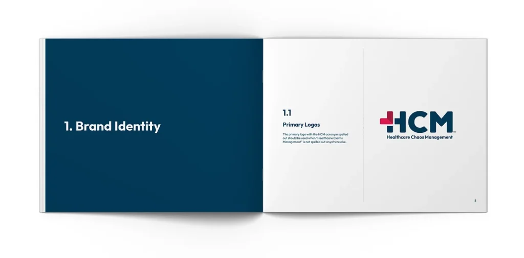
PRIMARY LOGOS
The primary logo with the HCM acronym spelled out should be used when “Healthcare Chaos Management” is not spelled out anywhere else.
Approved Usage, Size & Specifications, and Logo Restrictions
The information in this guide exists to educate and equip you with the tools needed to effectively use the HCM brand in various design situations while maintaining the integrity of the brand. Everyone is responsible for proper brand usage. For a complete list of approved usage, size & specifications, and logo restrictions, please download the brand guide.
Outfit should be reserved for high-visibility brand applications such as marketing materials, presentation cover pages, and campaign headlines. Its modern, geometric design reflects HCM’s forward-thinking identity, balancing structure with approachability. With clean lines and minimalist form, Outfit reinforces themes of precision, clarity, and trust in high-impact visual environments.
For all internal documents, client-facing reports, and long-form content, Aptos should be used. Aptos in black, size 11, is HCM’s standard for body text. It was selected for its professional readability and neutral tone, supporting clarity and focus without distraction. Aptos is a Microsoft native font, available across all Office applications, and does not require any manual download or installation. As HCM scales its operations and documentation across service lines, Aptos ensures consistency and accessibility in communication while maintaining a clean and compliant visual identity.
Color Palette
The color palette consists of two shades of red, navy blue, and a light blue-gray. To maintain brand integrity, the color breakdowns identify how these colors should be defined within various color spaces.
*Pantone Connect® swatches and color builds are updated regularly.
Swatches are subject to change.
PANTONE 1925*
C3 M100 Y63 K0
R230 G26 B78
#E61A4E
PANTONE 1945*
C23 M100 Y71 K14
R171 G29 B63
#ABID3F
PANTONE 302*
C100 M74 Y40 K33
R0 G60 B90
#003C5A
PANTONE 5455*
C25 M13 Y11 K0
R190 G205 B214
#BECDD6
Chaos Theory Butterfly
Chaos theory is the study of how systems that follow straightforward laws can exhibit complicated and random behavior.
Weather is a classic example.
Healthcare is another.
This illustration also compliments the tagline, “We love the mess,” and serves as an explanation to why HCM loves the mess.